Sunday, May 16, 2010

PhotoBlog #4


I found this photo on Hrystia Kaminska's photoblog. The photographer is Hrystia Kaminska. This gives no real place where it was taken, but considering Kaminska is Ukranian, it most likely was taken in the Ukraine. I like how this photo uses the motion principle to set up an interesting dynamic in the photo. The way the woman is brushing her hair makes it seem like wind is being blown at her which makes the picture very interesting. This most definately used artifical lighting because the photo was very staged and well set up. The emphasis is on the woman's hair and this is set up through the blowing of it and the way it appears frozen. I dont think any truly deeper meaning is found in this photo. But it most definatley shows the beauty in the world and it's people.

Sunday, May 9, 2010

Point of View Project Photos

Framing
This picture represents framing because it shows a subject being "framed" in a window. The subject is my little brother Shea and the frame is a window. I took this photo to evoke a grim, sad feeling. The framing truly helps with this goal because it makes it look like you are looking into the sadness of someones life. The framing gives the affect of a microscope into the mind of the subject.


Rule of Thirds/ Two Thirds
This picture is a classic example of the rule of two thirds because one third of the photo draws the eye and the other two thirds are merely a backdrop. I took this photograph after my brother attempted to eat chocolate and got it all over his hand. The detail of the chocolate makes it almost appear as muddy mountains on the palm of his hand. Coupled with the rule of thirds, the emphasis is clearly shown.


Spacial Relations
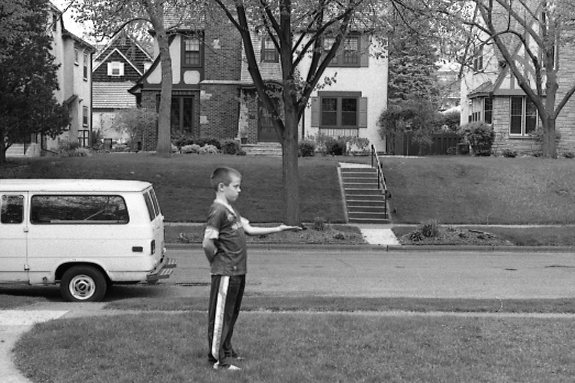
This photo is a representation of the dynamic spacial relations. The appearance of this picture is that of a mere boy having a tree grow out of his hand. This makes the picture much more interesting and appealing to the eye. The subject almost is transformed from a boy to a superhero who's power is growing various plants out of his limbs. I think this picture is a great example of spacial relations.


Value Contrast
This is a picture of a dark stem from a plant against a white back ground. This is an example of value contrast because the darkness of the plant is in direct contrast to the white, dull stucco. With this dynamic set up, it appears as if an artist had used dark paint against a white canvas. The set up between the subject and it's back drop is a classic example of value contrast.


Leading Lines
This photograph represents the visual dynamic of leading lines. The leaves of the plant appear to almost fall in and lead your eye to the middle of the plant, where the emphasis is. These lines really represent leading lines because they actually have the affect on your eye of pulling you towards the center or the emphasis. This is why this is a classic example of leading lines.

Friday, April 30, 2010

PhotoBlog #3

This is a photograph by Bill Brandt; a famous photographer. I found it on Masters of Photography.com. It was taken in the midst of the Great Depression in 1931-1935. I liked this photo because it really captures the essence of the urban poor during the 30s. The picture shows raw emotion and lack of wealth through the most innocent of faces; Children. I love this photo because of the gritty realism it portrays. This was natural lighting because it was taken outside looking into a house. There is high contrast between the children and the dark, cold brick. The most prominent composition skill used in this photo was framing. The 3 children were framed with in a tiny window looking outside. It also uses contrast with the white, bright looking kids to the harsh tone of the brick. The emphasis is obviously the children. They are the focus and subject of the picture. I think the photographer is trying the communicate the lack of wealth that was vast throughout the 1930's. It was almost a type of photo journalism that shows even the children are corrupted and fall victim the the plague that is povery.

Monday, April 19, 2010

PhotoBlog #2

I found this photo on National Geographic.com. It was taken by Harry Taylor. This picture was taken in Spring 2010. I really enjoyed how the bird was on top of a cactus and how vivid and in focus this picture was. The way the photographer achieved the vividness of the picture made it absolutely breathtaking. I think this is a very interesting subject and how Taylor captured it was most likely challenging and a tough job. This work he put into the photo makes me appreciate it much more. This picture was taken in Natural Lighting which makes it much more vivid and cool. The emphasis is most definatley placed on the bird and the cactus. Harry Taylor also uses this focus to make rule of thirds and a contrast against the blue background. I think the photographer is trying to communicate the beauty and how gorgeous nature is. Taylor wants people to recognize if you just look around, the world is a beautiful place.

Tuesday, April 13, 2010

Lines, Rule of Thirds, PowerPoints, and Movement.


This photo is a prime example of rule of thirds. It represents perfect proportion. The Boat and sun make up the emphasis points and proportion. The Rocks on the bottom perfectly fill up the bottom of the rule of thirds. This perfectly sums up the rule of thirds. Two things are emphasized in the photo and they math perfectly with the rule of thirds. That is why this is a photo with a rule of thirds.


This photo is a big example of the rule of thirds.
The photo has the left side emphasized because there is a lot of activity there. The other 2/3s of the picture is unemphasized and bland. The way the photographer spaces out the subjects really makes this a picture with rule of thirds.


This picture is a great example of power points. It really shows how the points on the line are the power points and emphasized. The bird is a prime example of emphasis. It is clearly the focus of the picture and also falls right on the line. This is most definatley an example of power points.


This photo of railroad tracks is a good indicator of motion. The picture is clearly showing how the lines indicate motion towards the back of the picture. The way the subject disappears with two lines into the distance is a big example of motion/lines.


This photo is a very strong indicator of motion. The way the subway seems to dissolve into the distance really shows the movement. The blurring of the photo makes the picture appear to almost be moving in a certain way. This photo truly shows movement and lines.

Wednesday, March 24, 2010

PhotoBlog #1


This photograph is by William Albert Allard.

I found it on National Geographic dot Com.

No specific date was given for this photo, but judging from the quality of the pic, it looks fairly recent.

I like the photograph because the emphasis placed on the elephant. The way it emerges from the grass makes you feel like it's running out at you. I also enjoy the detail every little hair got and how all the grass was uniquely bent in it's own way. This is natural lighting because it's taken out in nature. He used the rule of thirds to have the bottom be dirt sides be grass and the emphasis be placed on the middle grid; the elephant.

I don' t think this is any large social statement of a picture, but the artist is obviously trying to express the beauty of life and how spectacular the world's treasures are.


Jack O'Rourke